
Aquillius Corporation
OVERVIEW
Background–
In 2022, I had the opportunity to work for Aquillius Corporation, a life science and biotech incubator start up located in San Diego, California. I was working on a number of projects here, but Aquillius's primary need for me was to redesign the company's quality management system. This quality management system was initially the same interface and system used by their sister company, therefore it was my job to reorient and alter it to fit the exact needs of Aquillius.
My Role–
I was the sole designer on all UX/UI and media projects. Figma was my primary medium.
The Problem–
Aquillius had an immediate need for a company wide quality management system to help them organize and archive important information. The quality management system that was previously being used was adopted from Aquillius's sister company so it did not quite fit the exact needs of Aquillius. It was very clunky and had features that were not needed, lacked aspects that were necessary, and also was not intuitively designed. Prior to my hiring, there was no UX/UI designer. I was excited and motivated to be a one woman team and contribute my skills to improve the design of the system in a more seamless flow.


USER RESEARCH
From initially trying to familiarize myself with it on my own, I was right off the bat very overwhelmed. It had a very unwelcoming design and it was very apparent this interface was lacking any type of intentional design. I also realized that if I was so turned off by the format, then I could only imagine how utilizing this as an employee could be a bit frustrating and tiresome when trying to accomplish tasks.
I started out by producing a simple questionnaire that I sent to all employees to get a general sense of what the primary pain points were. From this initial research, I learned:
There needed to be distinctions between regular users/employees and the admins
01.
Not visually appealing; cluttered and unorganized format
02.
Not intuitive enough to understand steps of certain processes
03.
Missing functions and unnecessary functions
04.
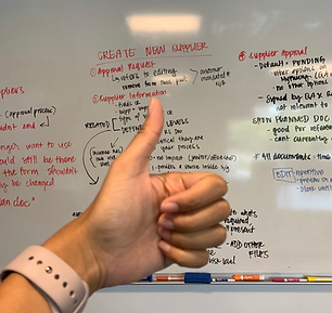
After identifying the primary pain points, I moved on to holding company wide meetings to get a more detailed breakdown of every single function within the QMS. Through this, the discrepancies came to light and I could easily detect where things were going wrong.
I made a user flow chart that outlined different steps and functions which was a not only a great visual for everyone, but enhanced our level of organization. The format of the current system was not intuitive enough to identify what step is next or what to log next, so providing this user flow chart helped map out the consecutive steps for each task.

DESIGN PROCESS
The original QMS system:
-
lacked color
-
had a left side navigation bar with tabs in an unorderly fashion
-
displayed right side/primary contents in a cluttered and crowded manner
-
required users to constantly go back and forth between tabs and pages within the system
-
overall messy and disorganized
Wireframes–
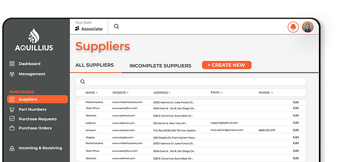
To start, I produced some simple wireframes that would capture the overall design, feel, and format that I was going for. This included a brighter colorway, concise verbiage, and a tab format where the user can easily tell where they are in the process they are actively working on.


First Prototype Iteration–
It was important for me to utilize more colors, not only for aesthetics but to have as an indicator of the the status of certain inputs. I also cleaned up the main content that takes up the majority of the screen so that it focused on one aspect or function at a time, which could be changed by the tabs at the top. Previously, there were multiple boxes shown at once that all pertained to different things, which contributed to its disorganized feel.


Second Prototype Iteration–
After reconvening with the team, we discovered that there were still missing functions and more items to implement. Additionally there were a few details in my design that did not transfer over into the actual working software, so I met again with our programmer to reiterate that the details of the design were getting executed.


REFLECTION.
Perspective–
As my time at Aquillius being my first official professional UX/UI role, I learned a ton! I learned how important it is to get to know your stakeholders. I was in the field of life science which was new to me, as it was something I was never before exposed to. This unchartered territory for me made it all the more important to really view the problem from their point of view. It is vital to take your time with the research and getting to know your end user.
Trusting Myself–
I also learned how to take initiative and lead. Since I was the sole designer at Aquillius, I had to get comfortable with trusting myself and my vision and not being afraid to speak up. While being the sole designer meant I could design in the way I best see fit, it also came with its own challenges. As I am a naturally introverted individual, I had to step up and out of my comfort zone to lead meetings and be respectfully insistent on what I know is right for the design which all boosted my confidence as a designer.
Communication & Patience–
My communication was also strengthened during this process. Again, being the sole designer really forced me to be clear and comprehensible to everyone around me. As the designer, I was the middle man between, our employees, higher ups, scientists, and our programmer so it was very vital to not only communicate in a digestible manner to whomever I was interacting with, but to be proactive about communicating things like bugs or updates. After all, I was the only designer so if I didn't say something, it would not get done or get piled underneath emails. Adjacent to communication, I also learned a lot of patience throughout the design process. Although I displayed only two design iterations, there are so many times where I would have to go back and forth between folks to make sure the design was the best it could be. Almost nothing comes back right the first time around. The process at times felt like the going back and forth would never end, but its important to be patient and persistent because at the end of the day, we all had the common goal of creating a better product.
Overall–
Overall, I couldn't have asked for a better first experience as a designer. Being the only designer on the Aquillius Team was exciting and daunting all at the same time but i'm glad it was that way. It forced me out of my comfort zone and made me a better designer with so much more confidence. I wish I could have seen my projects through to the end and have produced a finished project, but nonetheless I am so grateful to haev done for Aquillius what I did, and I am so excited to take all that I learned to my next endeavor.
Thanks for reading =)